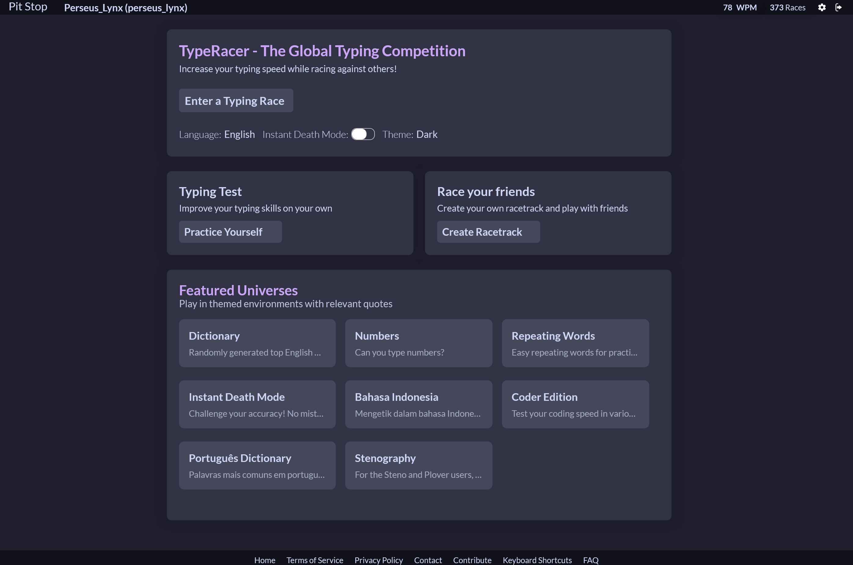
TypeRacer Re-Imagined
TypeRacer is an amazing mess.
It is the biggest platform for competitive typing races but the UI is just horrible in every possible way. It is cluttered, messy, bright mode by default and it hosts the worst table nesting that I have ever seen in my life. But worst of all it’s riddled with countless ads, they have 22 different html classes for ads and subscription prompts.
So, what do you do when you don’t like the visual aspect of a product but love it’s function? You customize it and give it some Catppuccin love!
The creation
To customize the website I used the amazing browser extension Stylus, it is one of the most extensive repositories of CSS styles that there are and inside the extension you can install any style that you want or write your own.
I didn’t plan to create one of the most comprehensive user styles of the website. In the beginning I just wanted to get rid of all the ads and subscription prompts. But one thing lead to another… and I stared removing (technically hiding) more and more elements to try to achieve a minimalistic experience.
But then, I added the catppuccin colorscheme. And then is where things got out of hand.
I created my own layout of the website, applied the style to every possible page and element that there was, I made it compatible with different sized screens, added easter eggs and memes and in ten days or so it was complete.
Features
- No ads nor self-promotion
- Minimal UI
- Catppuccin Colortheme
- Responsive Elements
- A sprinkle of memes
- 2k+ lines of code with helpful comments so you can customize it on your own